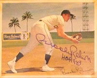
On the one hand it's not surprising because the 1956 Topps set was one of my childhood favorites. On the other hand, working in the '56T style is one of the most challenging. Besides needing both a portrait and an action picture for the front of the card, three cartoons are needed for the backs.
The process of rounding up the cartoons is one of the hardest parts of assembling a "new" '56. I generally start by plotting out five or six possible highlights. Then I go through my stack of 100 or so original 1956 cards to try to find cartoons that can be re-purposed. Re-using original cartoons helps give an authentic look to my card backs.
In a pinch, if I can't find anything appropriate among my '56s, I sort through the 1989 Topps "Big" cards, which used a similar style of cartoons on the back.
You might not realize it, but another challenge in recreating the '56 format is getting the autograph for the front. Guys like Brooks Robinson are easy; I prefer to pull them from the old Baseball Register, where they are in clean black-and-white. However, while I used to have complete runs of Registers (and Guides) when I worked at Krause, my current library of those volumes is quite limited.
Among the 1956 customs that I've done, acquisition of three autographs was especially challenging. Charley Peete played only 26 games in the major leagues for the 1956 Cardinals, and died in a plane crash later that year. Similarly, Tom Gastall played just parts of the 1955-56 seasons for the Orioles, also dying in a plane crash in 1956. Stu Locklin had a 25-game big league run with the Indians in 1955-56, but he is still alive and signing today.
One of the next '56s I've got on my to-do list, Paul Cave, played nine seasons in the minors in the Boston/Milwaukee Braves organization without ever making the majors. But as a kid I looked -- in vain -- for a long time for his baseball card because he was shown and named on the 1956 Topps Milwaukee Braves team card.
 Getting back to my '56 Brooks Robby, I spent considerable time putting the card front together. The background comes from a circa 1963-65 premium picture taken in spring training. I no longer remember where the action photo came from; it's been in my files for quite a while. It was also a spring training photo, and I cropped out a sliding Cleveland Indian and colorized the Robinson figure.
My original plan for the portrait photo was to use the picture that Topps used on his 1957 rookie card, but in a last minute google search I found a different early portrait that would give my card a more original look. I had to colorize that photo, as well as adding a new oriole image to his cap.
There's really nothing I can tell you about Brooks Robinson that you don't already know, so I'll just give you the first look at my newest 1956 custom.


"Really" like the '56 Brooks card. Of course I wish he really did have a card this year; would have been cool. I like that you used my picture of Brooks at spring training for the background for the card (Unsure what the picture relates to. Possibly advertising the sneakers or the bank). The sneakers look really out of place so that's what I'm leaning toward.
ReplyDeleteI know the fielding pose you used was on cover of the book "The Brooks Robinson Story" by Jack Zanger. I also have a press/wire photo of this shot as well (somewhere...)
Personally I would of picked a different portrait picture of Brooks, but like the one you used from I believe '64. There's several other early pics from his rookie era, but that's just my humble opinion since he looked like a kid coming up to the bigs (of course he was...).
Thanks so much for creating the Brooksie card!
Regards,
Mark